AutoPay signup improvements
A series of A/B tests to improve our AutoPay sign up rates that resulted in a 9.9% total increase in sign ups, with a new test currently underway
Role
Tools
Team
Timeline
1 month test 1
1 month test 2
4 months funnel redesign
Summary
As part of Prosper's goal to reduce our charge-off rates from users in our credit card, we looked to AutoPay as a lever to pull to keep users from entering delinquency. As such, we ran a series of tests to try to figure out the best version of the AutoPay sign up flow within our credit card funnel.
Project overview
Business problem
How might we reduce our charge-offs by increasing AutoPay signups within the credit card funnel?
User problem
How might I easily sign up for and manage my payments with AutoPay, while maintaining flexibility over my finances?
Hypothesis
Not all users want to sign up for AutoPay, so our best levers to increase sign up rates are to showcase the $0 annual fee, the limited availability of that offer, and to simplify the value props.
Understanding & defining the need
Based on our historical research on why a user might sign up for AutoPay, we knew that there is a subset of users who are uncertain of their monthly income, and would never sign up for AutoPay as a result. After looking back on that past research, I worked closely with a content designer to target the people who had potential to sign up with designs that increased the urgency of the $0 annual fee offer, without making our users who wouldn't sign up feel guilty about not signing up.
Methodologies
User interviews | Surveys | Ideation sessions
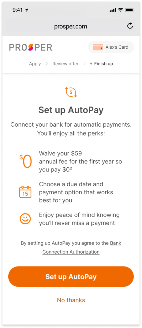
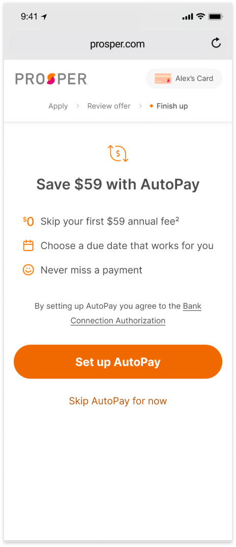
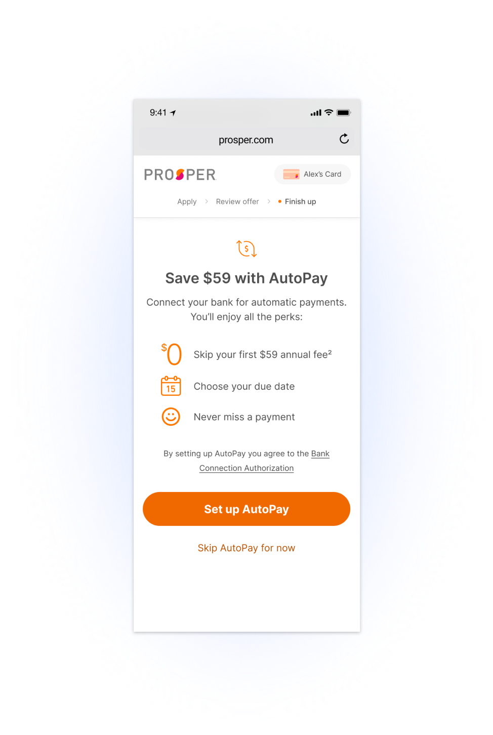
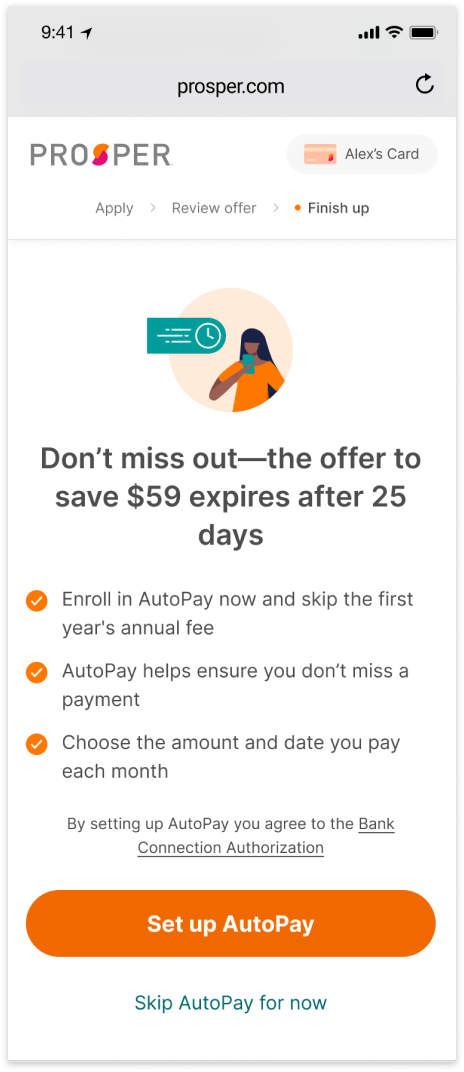
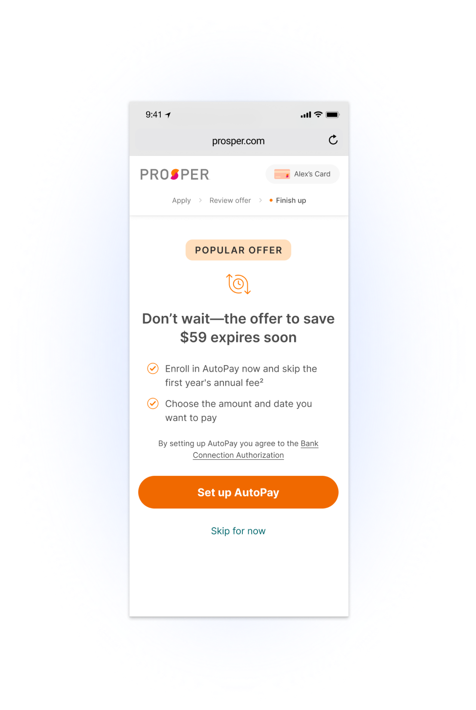
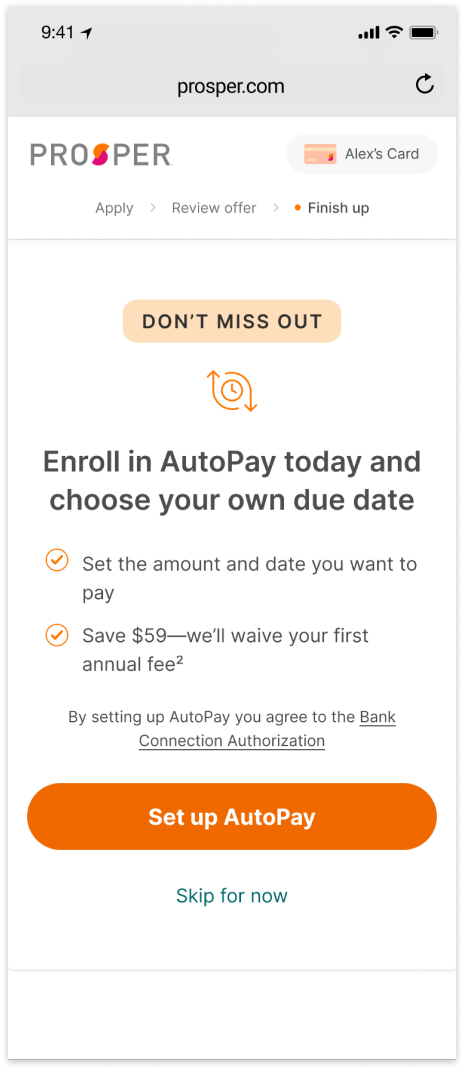
Test 1: First funnel page
For this test, we ran an A/B/C test comparing the control to two new designs. One was a completely streamlined design, aimed at seeing if we had too much content on the page. The other was testing a similar design with new content that put the main value of AutoPay—no annual fee—into the headline.
placeholder
Control
placeholder
A
Winner! +412 bps
B
Test 2: Second funnel page
Lovingly dubbed the “Are you sure?” page by our team, the next test for AutoPay enrollment was the page that appears if a user declines to sign up for AutoPay on the previous page. We wanted to see if a trimmed down design might better surface the value of AutoPay without annoying the user. We also wanted to test into social proof, as well as if choosing your own due date would be more interesting at this point, so we ran another A/B/C test on this page.
placeholder
Control
Winner! +550 bps
A
placeholder
B
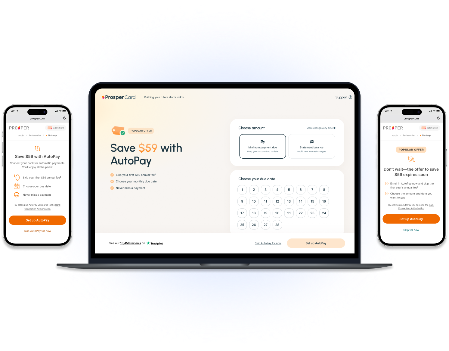
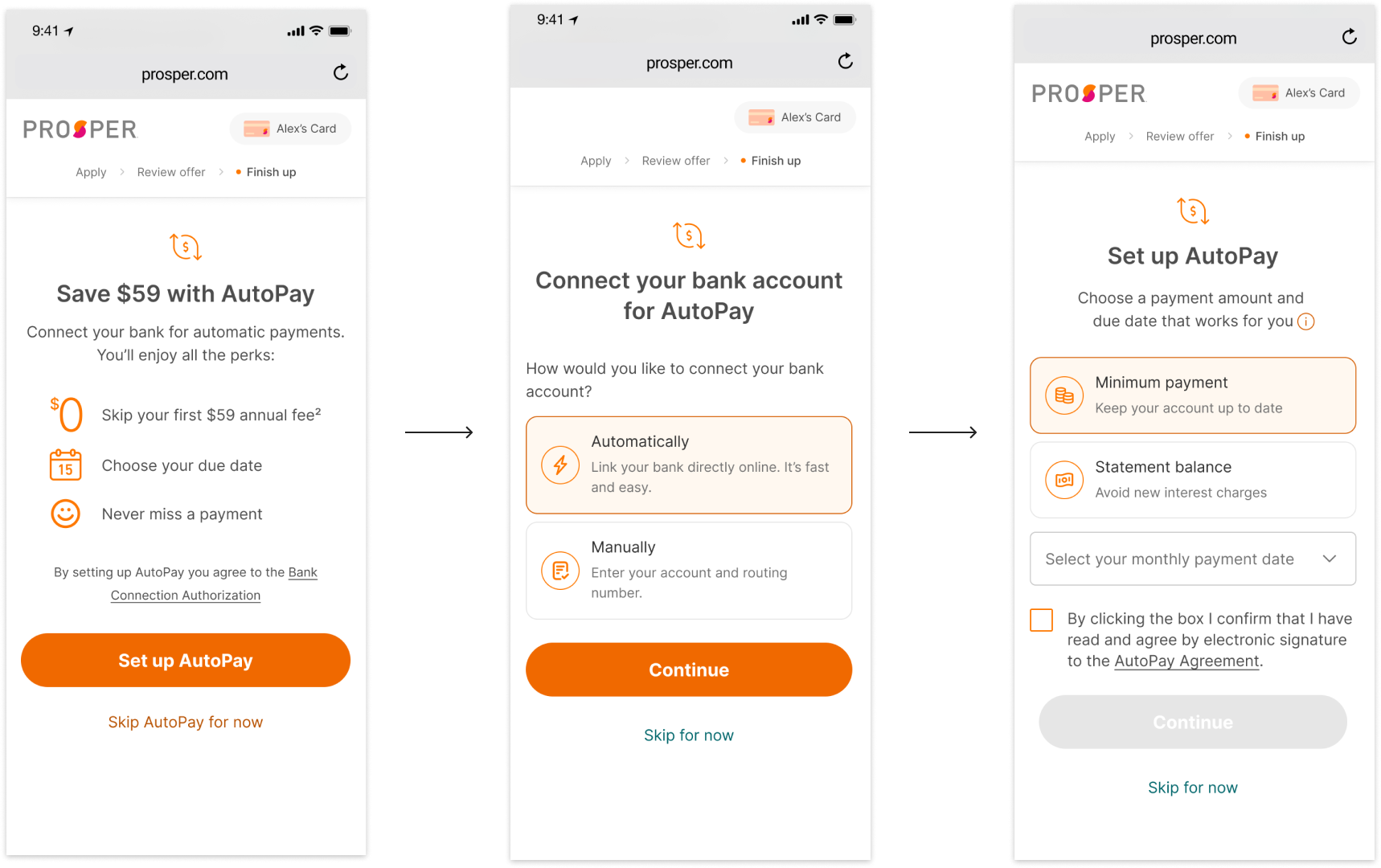
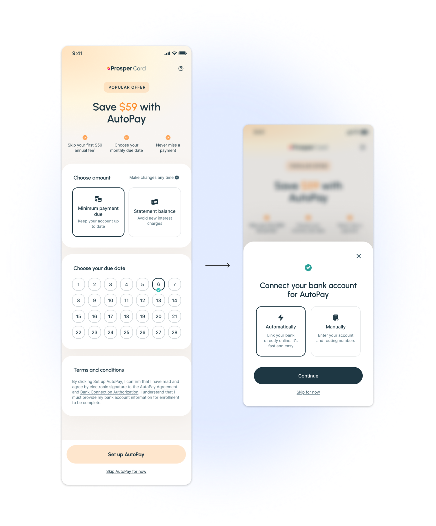
Test 3: The full funnel redesign
While running these tests, we realized that our AutoPay flow itself could use some improvements. Once a user opts into AutoPay, they're taken to a screen to add their bank account, then another screen where they can choose their amount and due date. I had the thought that asking a user to add their bank account before they see the secondary benefit of AutoPay—choosing their due date—might be adding friction to our sign up flow. So, when I finally got the chance to move our funnel into our new brand, I pitched restructuring the flow of AutoPay itself—removing friction by having the sign up come before the bank account, and consolidating two pages into one, while maintaining the learnings from our previous tests.
Control
Test in progress
Currently +210 bps
Test
In the end
Impact & results
The first two tests have resulted in a 9.9% total lift in AutoPay signups in the funnel.
The funnel redesign is currently underway, so the final results are pending, but it's currently up by 2.1%!
Lessons learned
At the end of the day, this really proved to us that the main value prop for AutoPay for us is the promotion that gets rid of the annual fee—none of the other reasons to turn on AutoPay are compelling.
We also learned that the scannability might be more important than the designs seeming streamlined.
Next steps
Once our funnel redesign test finishes, the next test we'll run is making a series of incremental improvements on the bank connect page! We're hoping by making it easier and explaining the concept that we will reduce drop-off.