Authorized User: Building a new feature to increase users and spend
A focused case study on the process of building out a new product offering for our credit card users.


Role
UX designer
Tools
Figma (Variables, Modes, Auto Layout, Component Properties), Dovetail, Askable, Confluence, React, Gemini
Team
UX designer, content designer, UX researcher, product management, legal & compliance partners, engineering partners
Timeline
6 months
1 month discovery
1 month test and iterate
1 month refinement and socialization
3 months building
Summary
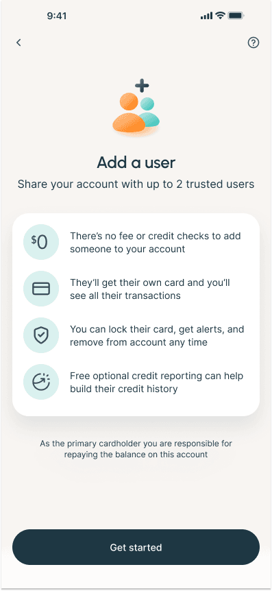
As part of Prosper’s goal to increase net spend on our credit card, and also increase the number of card accounts, we decided to launch a new product line. This product, internally referred to as “authorized user,” would allow a user to add someone to their credit card—potentially building the AU’s credit while allowing them access to additional funds through the primary cardholder’s card.
Project overview
Business problem
- How might Prosper increase receivables by adding more active cards and users to a single account?
- How might Prosper significantly improve customer retention by increasing switching costs and embedding the product into users’ core household finances?
- How can Prosper build a low-cost, high-intent acquisition funnel by creating a positive brand experience for AUs that primes them to convert into their own primary accounts?
User problem
- How might I easily and securely share a payment method with family members or other trusted individuals while maintaining visibility and control over their spending?
- How might I help a family member build their credit history using my established account?
Hypothesis
Based on our assumptions that a user will want to give their AU card and spend access to help manage household spend, we hypothesized that allowing users to share their card will increase spend on the card and create more Prosper accounts long-term once the authorized user moves off the card.
Most of our users are on our credit card app, so any minimum-viable-product should be mobile-first.
Understanding & defining the need
My team and I first wanted to understand why someone would be adding a user to their credit card and what features they’d want to see, so we could build the best experience possible. We started with user research on the basics, as well as competitive analysis—partially assisted by AI—so that we could fully understand the problem space before beginning. I used these findings to work with product on defining the PRD.
Methodologies
Card sort | User interviews | Competitive analysis
First round ideating & refining
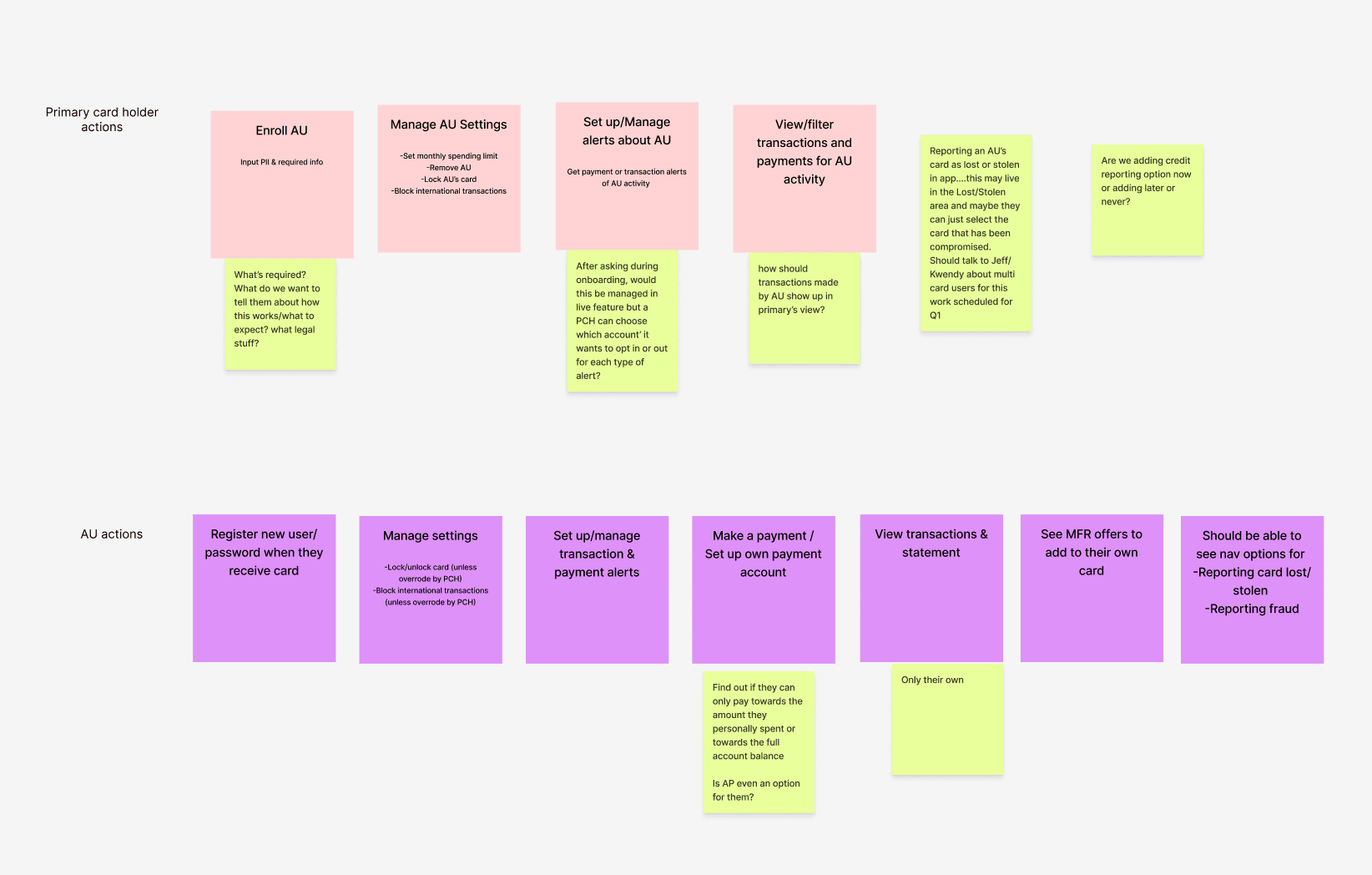
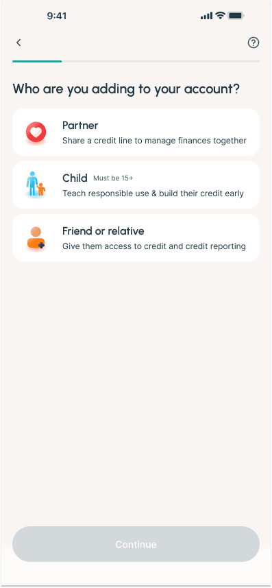
Using our findings from our foundational research and card sorts, I led a brainstorming workshop to begin honing in on what our user needs were—for a primary cardholder as well as an authorized user. Our research showed that there were 2 main types of primary cardholders to build for:
- Someone adding a partner or close family member to manage household spend on a high-level—seeking transparency, spend management tools, and account access for their AU
- Someone adding a child or other dependent—seeking controls, one-way visibility, and often looking for credit building features for their AU
Based on this, we set off to build for both use cases!
The process
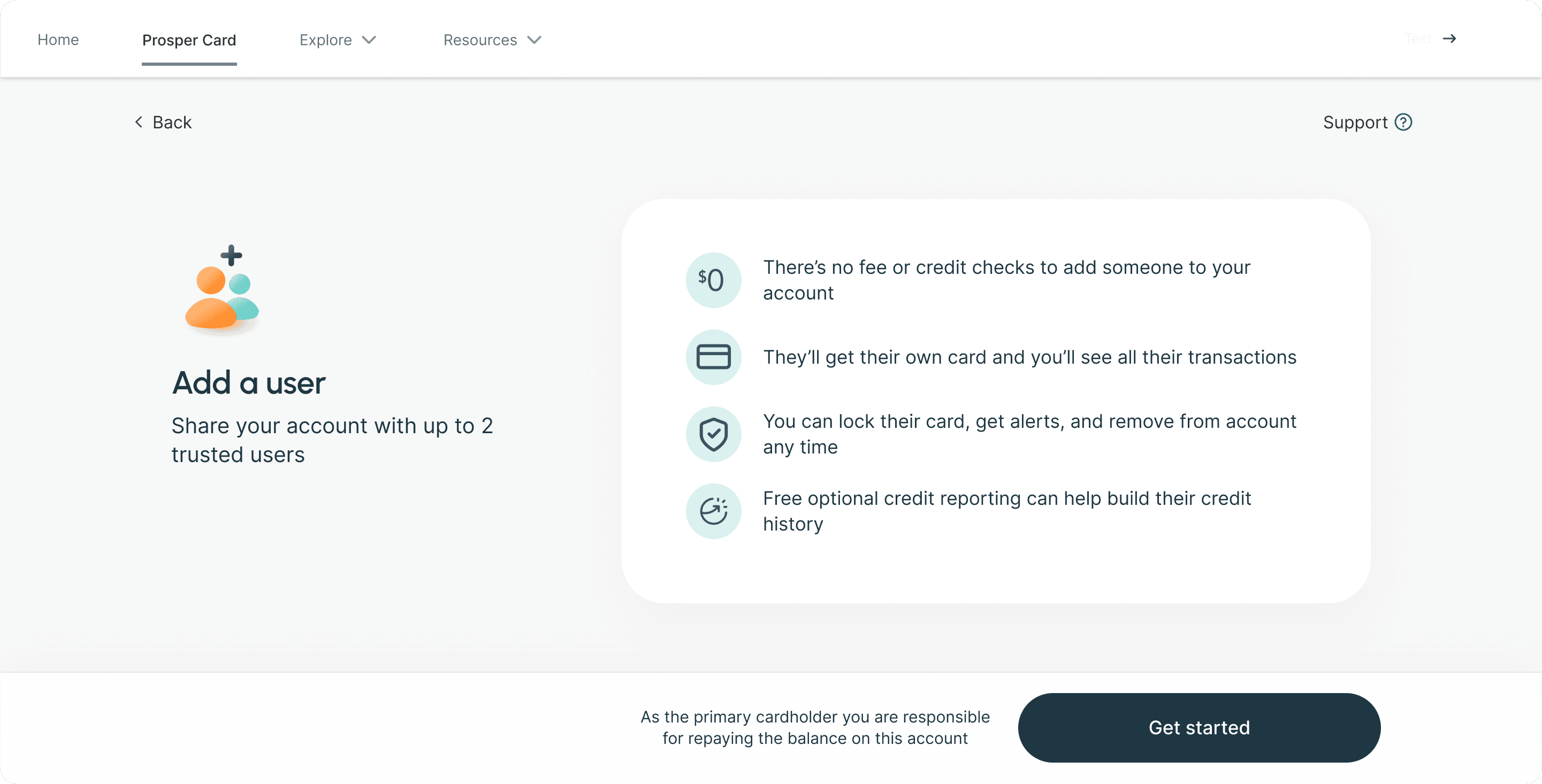
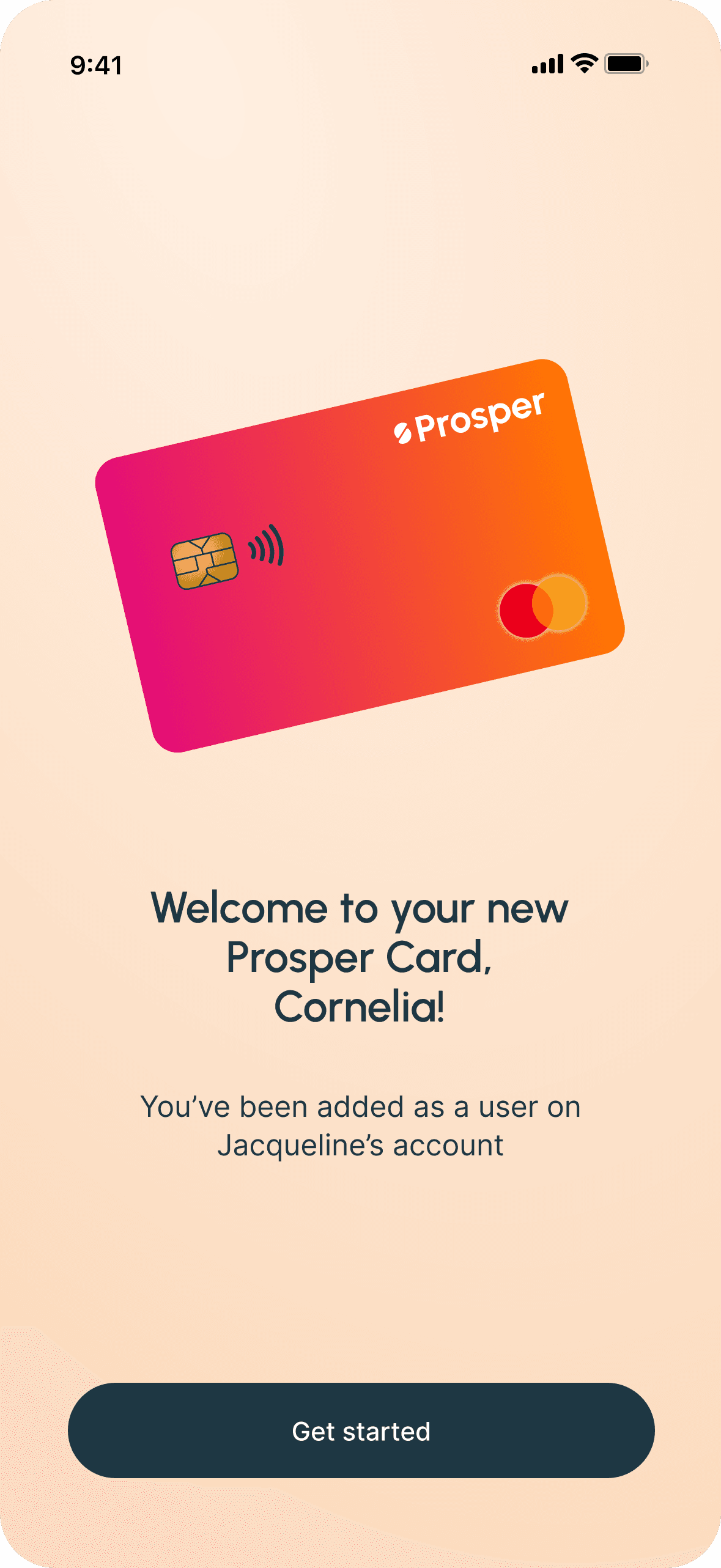
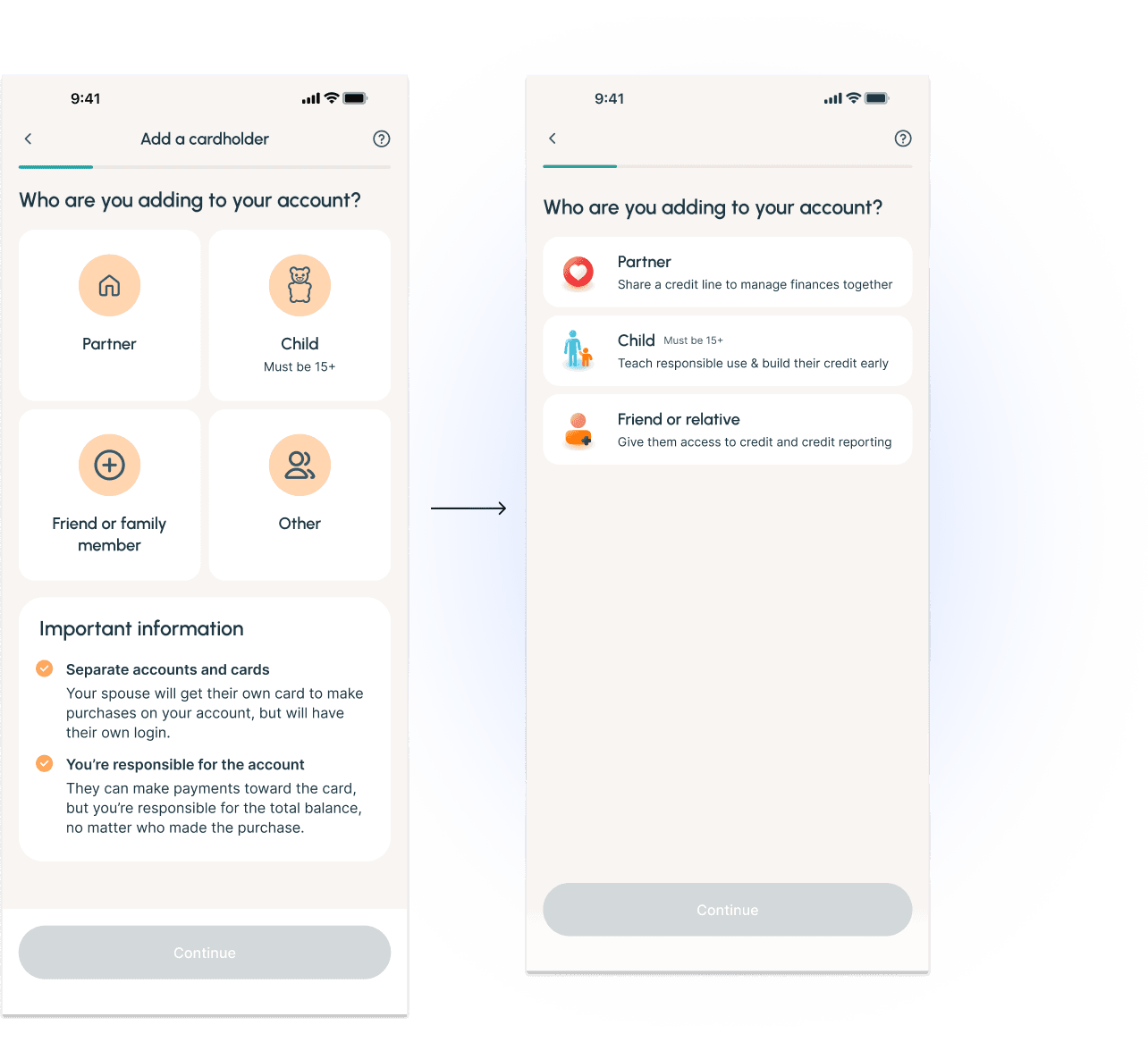
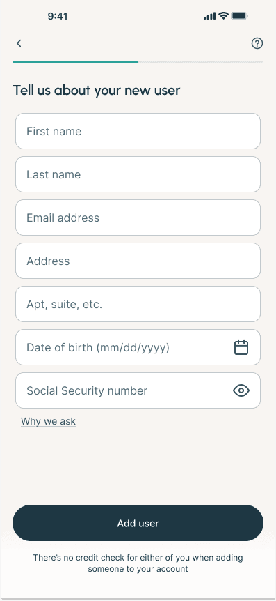
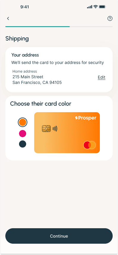
- Finalize user flows: After combining our level-setting research with our brainstorming work, I built out the flows for adding a user, managing an additional user, and joining the app as an additional user. I also worked closely with our content designer to make sure that we were being as clear as possible, so all users know what they’d be signing up for.
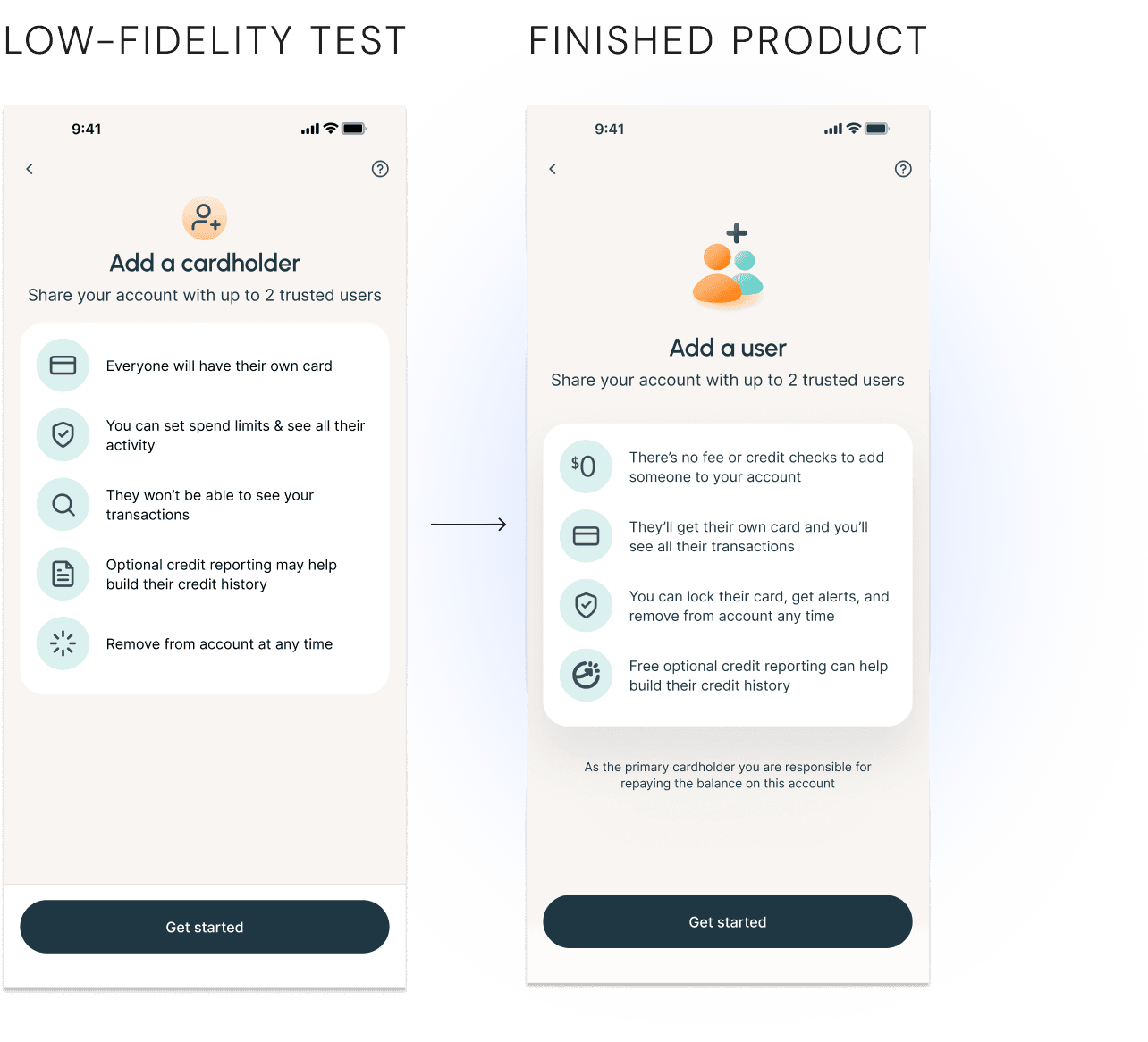
- Develop a prototype: After receiving product sign-off, I designed a prototype to be used in our next round of testing, where we had users walk through adding someone to their card.
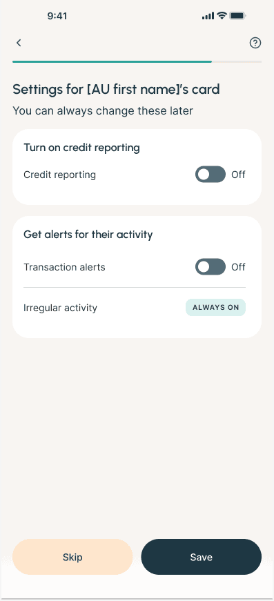
- Incorporate findings: After testing, I updated some of the flow to better suit our user’s needs and solve for pain points in the process. For example, we found that while users appreciated the information, the amount made any place where information was lacking (such as the “Optional” credit reporting not being labeled as “free”) made it seem like it could be hiding something. I also refined the designs to better match our look and feel.
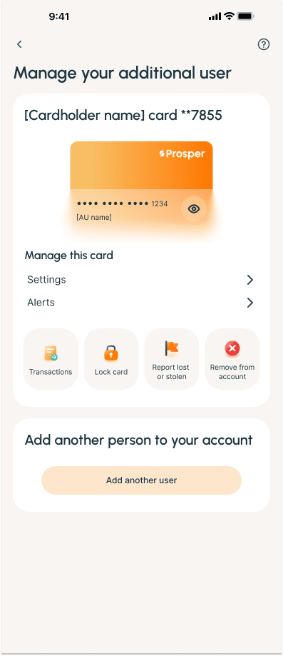
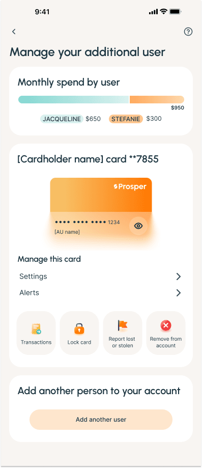
- Design the servicing experience: Once the designs for adding an authorized user were more finalized, I took what we had learned from testing and research and used it to update my low-fidelity designs for the servicing experience of how a user could manage their additional user once they’d been added. After learning that some cardholders would want more control than our original hypothesis, we surfaced those controls and added functionality to better meet user needs.
- Manage MVP scope: Due to our quick timeline for launch, product asked us to try to trim down the final product in order to speed up engineering’s timeline. I worked with them and engineering to figure out what could best be cut—without making the user experience significantly worse.
- Stakeholder alignment and refinement: Before sending everything off, I brought our engineering and legal partners in one last time to see the final designs and make any changes deemed necessary for a fast and seamless launch.
The solution
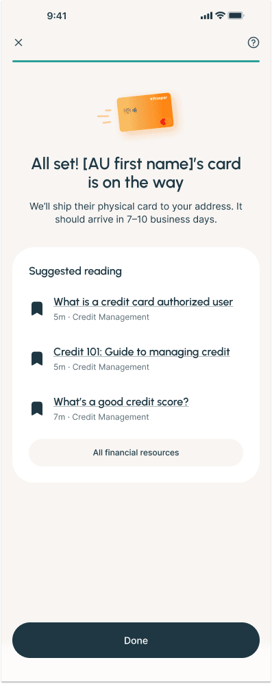
What we came up with was this: a streamlined funnel that level-set with users up front without being overwhelming, something that our users felt was missing from other experiences and appreciated in ours. We offered optional credit reporting and controls to let primary cardholders feel in charge of their credit card, and built a spend tracker for optimal transparency.
Finally, because we found that the use cases were different for different types of primary cardholders, we added in a screen to track who is being added—that way we know who to build for in the future!
In the end
Impact & results
This is slated to launch soon! As a result, we don’t have any real results yet, but I will update when we have them.
Expected results:
An additional $400k per month in end net receivables
Additional success metrics:
Adoption rate
Retention rate
Utilization rate
Low support call volume
Lessons learned
Although we originally expected a pretty large impact from this project, we had to scale it down a little bit after our research showed that some users add an AU just for credit building, but then put the card in a drawer so they don’t spend anything on it.
Because we had to descope the launch due to time constraints, I wish we had run additional user testing on “needs” vs “wants” once we had our design, so we could make more informed decisions around what to cut.
Next steps
I’m working on what our post-MVP experience will look like, including a spend control function and increased alerts, for more hands-off maintenance for the primary cardholder.
The full account experience for an authorized user who wants to sign in to make payments or manage their experience was descoped for MVP, so that’s also on the docket!